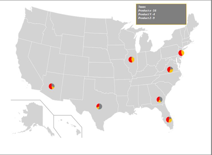
If you want to show pie images as markers on the map . Snapshot below -

Download the working file
How it is created?
The process is divided into 4 sections
1 Create X Y chart and add US map as background image to the chart

3. Run a loop through all series and import the image of pie charts to the markers using macro
4. Add chart events code to hide or unhide the textbox on chart sheet and add text to be displayed using VBA
Download the working file
https://www.box.com/s/gmxlj86nykwwyx9rxvw9
Steps to use
Download the working file
How it is created?
The process is divided into 4 sections
1 Create X Y chart and add US map as background image to the chart
- Create a simple X Y scatter chart
- Fix the X axis and Y axis option to fixed snapshot below
- Insert US map image as background of the chart
- Right click on chart choose Format Plot Area
- Choose Fill -> Picture or Texture
- Click on file and choose the location of US Map (Map Source http://en.wikipedia.org/wiki/File:Blank_US_Map.svg )
- Now Manually choose X and Y axis for each state
- Right click on X and Y axis choose Format Axis -> Line Color -> No line
- Right click on X and Y axis choose Font color as white
- Remove grid lines
3. Run a loop through all series and import the image of pie charts to the markers using macro
4. Add chart events code to hide or unhide the textbox on chart sheet and add text to be displayed using VBA
Download the working file
https://www.box.com/s/gmxlj86nykwwyx9rxvw9
Steps to use
- Save it on your desktop in a new folder
- Open the file
- The file is having three tabs
- Map - It’s the chart sheet which is updated automatically by macro
- Lookup - You will find the x and y coordinates for each state listed. Please note do not delete this tab
- Data – You will add the data on this tab. The sheet is divided into three sections
- Manual Inputs
- Col A-
- Add state names in this column
- Make sure you pick the state name from the Lookup sheet
- Col B:D
- Add product details in these columns
- You can rename the headers as welL
- If you want to add or remove any product .Please make sure you change the references in macros “change_source_data” and “create_charts”
- Make sure you add color to headers. All pie charts are formatted on the basis of header color
- Automatically Created by macro
- Col E
- Macro will automatically create these charts and export them to the folder
- In case if you move the position of this column .Please make sure you change the column reference in macro “create_charts”
- Formula columns
- Col F
- Add the text you want to display in text box of Chart sheet
- In case if you move the position of this column. Please make sure you change the column reference in the Map “Chart_MouseMove” event
- Col X : Y
- Get X and Y coordinate of each state from lookup sheet
- Please note macro is picking x and y coordinates from these columns to update the chart
- In case if you move the position of this column. Please make sure you change the column reference in macro “change_source_data”
No comments:
Post a Comment